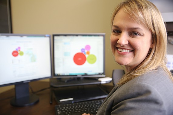
Melissa Gibson, senior consultant at PSC crunches the numbers to beautiful effect.
When it comes to high-quality information analysis, the numbers can become overwhelming. But Public Sector Consultants has always prided itself in being ahead of the curve in policy and research, so why should the firm’s approach to data technology be any different?
To produce a recent report for the Michigan Nonprofit Association (MNA), consultants at PSC utilized visual presentation tools to represent figures in ways that are more engaging than traditional graphs and charts.
The novel difference was Tableau: visualization software that allows users to quickly generate interactive graphic displays, representing facts and figures in ways that “[help] people see and understand their data.” The displays offer a variety of options on a dashboard — such as interactive charts, colorful graphs and other dynamic visuals — that users can easily manipulate by selecting what they want to see.
Originally developed in 2003, Tableau has always been in the background of the many options for visualization software. But unlike more popular products, Tableau users don’t need to have training in graphic design to create the same professional results.
“We’ve always created visual data like we’ve done recently with Tableau, but it was a manual process between an analyst and desktop publishing staffers,” says Jeff Williams, PSC’s chief executive officer.
“Now that the software has finally caught up with us, we can generate insightful images and charts more consistently and efficiently. We can even customize the images to a specific region or population on the fly.”
Though many of the displays Tableau offers are available in other software, the difference is in interactivity and user control.
“We were able to take data we’ve presented to MNA before and reframe it to allow for a more interactive experience,” says Melissa Gibson, senior consultant at PSC. “We could always separate reports by types of reports and various regions, but now we can offer clients information they can access quickly without having to dig deep because information is concise and visually linked.”
The recent project presents the economic impact of Michigan’s nonprofit sector divided by geographic regions, type of nonprofits, social functions and years. It even includes data from previous projects between MNA and PSC in a new format that everyone can understand.
“Not many of us love to pore over numbers,” says Joan Bowman, senior director of public affairs and communication at MNA. “When people can visualize them, we can reach so many more people.”
The display offers multiple forms of presentation — including a traditional table of data by region, a regional map of Michigan and a visual comparison of the different nonprofits and social functions — so the information means more to everyone.
“Telling our story, the story of the nonprofit sector, is not as easy as it is with the business, corporate, or public sectors,” Bowman says. “There are all kinds of data on that, and people understand the contribution of those sectors, but not so much with nonprofits.”
For PSC, this development in data presentation has given them access to a wider set of options to give clients what they need every time.
“We’ve always wanted to do more with the data,” Gibson says. “Now we can.”
Since PSC has been using Tableau, their clients have been able to do more with their products.
“Of all the tools I’ve had, I’ve used [this data] in almost everything I’ve done,” says Bowman. “When I have some fast facts at my fingertips if I’m giving a presentation or talking to people about who MNA is and what we do — when I say that Michigan nonprofits number more than 42,000 — people are taken aback.”
And that means data doesn’t have to be overwhelming any longer.
“These regional tables and the data that comes from them just make it so much easier for me to tell my story,” Bowman says.